Joan Blaeu's Nova totius terrarum orbis tabula (1648)
Explore a 17th-century cartographic masterpiece
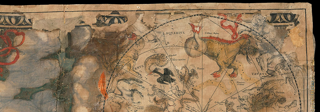
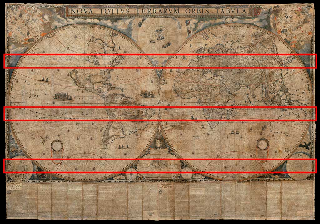
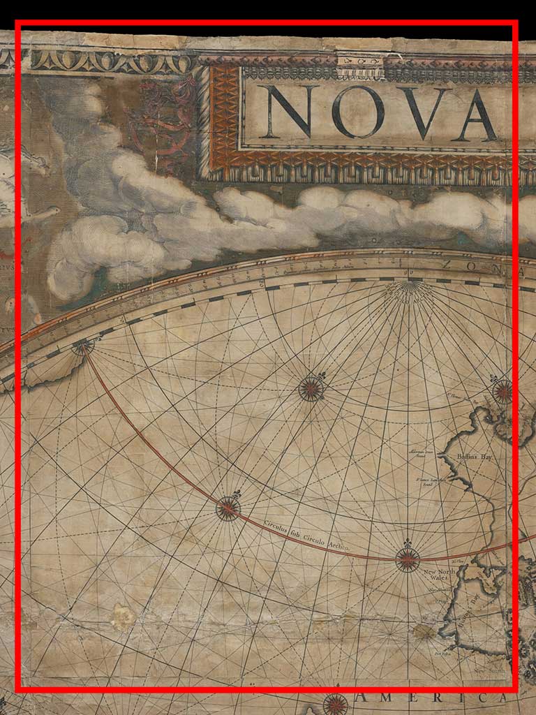
In 1648, the Amsterdam-based publisher Joan Blaeu (1596–1673) started selling a map that stands as one of early modern Europe's greatest cartographic achievements. Measuring nearly 7 x 10 feet and requiring 21 sheets of paper printed with copperplates and 10 printed with movable type, it depicts the entire world as two hemispheres, with many details based on recent observations from trade and colonization efforts.
-
Introduction
At its size and price, copies of Blaeu's map would have been destined almost exclusively for the walls of the affluent and powerful. Some of its first owners were probably merchants of the Dutch East India Company, who from their homes in Northern Europe could look at it and picture the far-off sources of their wealth and the routes that were bringing it to them and their countrymen. Owners likely used the map to show off to visitors their own status as men and women of the world, too.
At the Ransom Center is one of three copies representing the first state of Blaeu's engraved plates that survive intact. It came here along with numerous other early maps, atlases, and globes in 1969—all purchased from the same New York bookseller, H. P. Kraus. Kraus's own source for this copy and its early history, however, remain obscure.
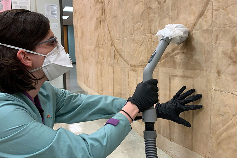
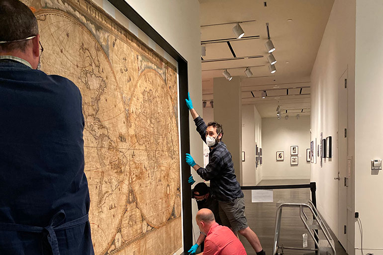
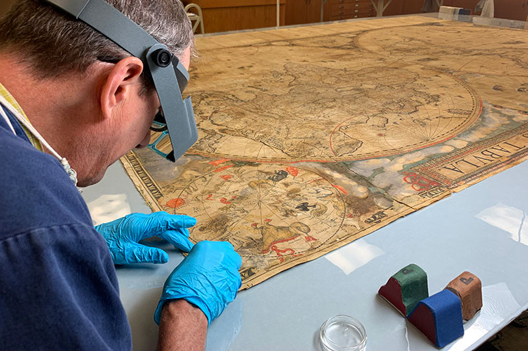
Because of its precarious condition, the Center was unable to display the 1648 Blaeu in its galleries. In 2018, we began a multi-phase conservation treatment project to stabilize and frame it. Our team started by examining and documenting every inch of its physical structure. Among other things, conservation and exhibition staff undertook technical analysis of the paper, linen backing, colorants, and adhesives—and the interactions between them. An extensive conservation treatment followed, and we worked with an outside vendor to design and build a custom frame for display and long-term storage. It has also been newly digitized, as you can see below.
The following sections discuss four aspects of the Blaeu map associated with our analysis and treatment. Many questions about its life are still unanswered—in fact, we probably now have more questions than we started with—but there are clues that point toward a multi-layered backstory.
-
Hanging
Maps famously feature in the paintings of Johannes Vermeer (1632–1675) and other Dutch artists, where they hang on the walls in a number of interior scenes. Here, for example, is a detail from Vermeer's The Art of Painting, which includes a sizeable map of the Netherlands in a painter's studio.
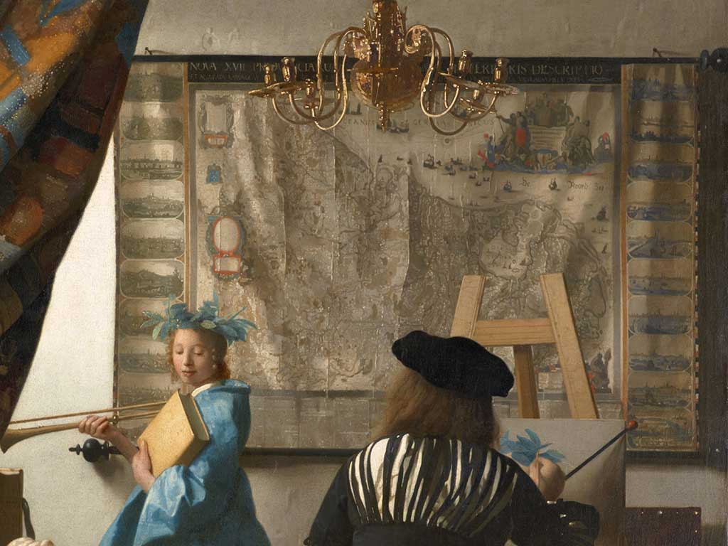
Detail from Johannes Vermeer, Untitled [The Art of Painting], about 1666/68. Oil on canvas. Kunsthistorisches Museum Wien, Gemäldegalerie.
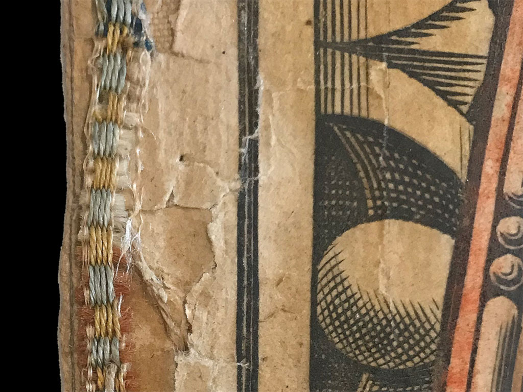
In another of Vermeer's paintings, a smaller map appears in a standard, four-sided frame, but here and in others by him, large maps have had rods attached to the top and bottom edges. Called “rollers,” these allowed maps to be rolled up for storage or transport, and they required substantially less material than a traditional frame while still displaying elegantly. In the Ransom Center's copy of Blaeu's 1648 world map, there are several repaired holes—some completely torn out—where nails once secured a pair of rollers to it.
In The Art of Painting, there are also alternating blocks of color along the right and left sides of its map. These may represent a type of textile known as block trim or fringe, a type of decoration we can still see on the Center's Blaeu. On the map's trim, there are four alternating colors in the weft—white, red, yellow, blue—and silk overlays in yellow and blue. A lighter color silk warp binds the edge. Because block trim was popular for several centuries, it is difficult to ascertain whether ours is roughly contemporary with the map's 1648 publication or from somewhat later.
-
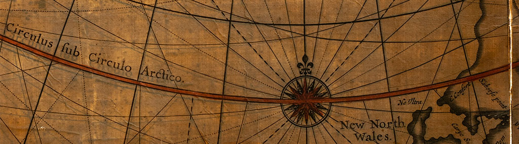
Creasing
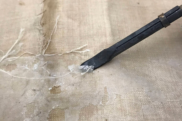
To turn Blaeu's printed sheets into a map that could handle the force of gravity when nailed to rollers and hung, they were first adhered to a linen backing that is itself made of several different pieces of linen (flax) as revealed through FTIR analysis. Over the years, the map has gotten wet, leaving stains known as tidemarks and warping the surface somewhat. Paper has also cracked and split along some of the seams that join pieces of the backing together and from uneven stresses while hanging and/or storage while rolled.
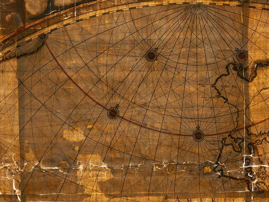
The most significant damage appears at the top edge of the map, where some of the original paper has been completely lost; this tearing was presumably caused by the linen-backed paper pulling away from the top roller.
Additionally, there are three large horizontal creases where the map appears to have been folded into fourths, probably while its rollers were still attached. Water appears to have exacerbated damage along parts of these and other creases.
Much of our conservation team's painstaking work on the map has been dedicated to relaxing creases and re-adhering paper where it has cracked and lifted from the backing. We have stabilized damage without hiding the evidence it offers about the map's history. The photos above were taken after treatment.
-
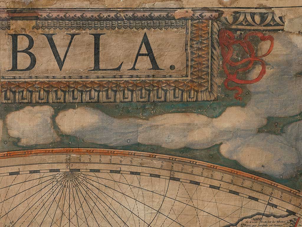
Patching
One of the most curious aspects of the map is a major repair to the second sheet of paper in the first row, which is mostly occupied by the Arctic and Pacific Oceans.
With light projected through the map from behind, we can see that one full copy of the sheet has been pasted over with part of another copy, forming a patch that extends from the bottom edge of the engraved image up to the curve of the hemisphere.
The reason for the patch seems simple enough: the underlying copy of the sheet has significant losses near the bottom, left of center. But we are not completely sure when and how the loss-causing damage occurred and when the patch was applied.
Most of the available evidence suggests that the underlying sheet had already sustained damage prior to the map's assembly on the linen backing—or that the damage happened during the mounting process itself. For one, the sheet's bottom edge extends under the sheet immediately below it but still includes areas with loss: how could that edge have sustained loss after mounting if it was already sandwiched between the linen backing and the overlapping sheet, which both remain intact?
In addition, although one of the large horizontal creases passes through the areas of the full sheet that show losses, splitting and losses associated with that crease affect the paper of the patch, too. In fact, some damage along the crease affects the patch and only the patch, seemingly guaranteeing that the crease formed after the patch had been applied and after the underlying sheet saw its losses.
Also in favor of the losses being early is the basic existence of the patch itself: as far as we have been able to determine, the patch was printed on period paper with Blaeu's original plates and is not a modern reproduction. Presumably, then, it was acquired (directly from Blaeu?) not very long after the map's original publication. This suggests, too, that the full map was first mounted and hung at or around the same time, before Blaeu's death in 1673—probably in the later 1640s or early 1650s.
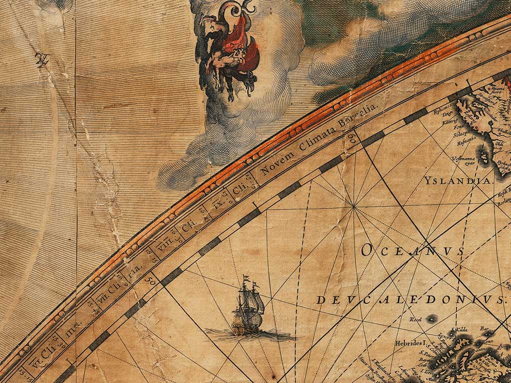
As is apparent here, color was not applied to the line marking the Arctic Circle until after the patch was added.
-
Coloring
As part of their analysis, the Center's conservation team worked to identify the pigments used for the map's hand coloring. To do this, they used polarized light microscopy (PLM), which makes it possible to see the distinctive structures of some pigments with a microscope, and x-ray fluorescence (XRF), which can reveal pigments' elemental composition.
Testing revealed a number of the pigments to be standards: lead white, red lead, vermillion, yellow ochre. These show up in art centuries older than the Blaeu and quite a bit newer, too. They do not do much to help us pin down a date for the map's coloring.
One color, though, appeared to offer conclusive testimony. When we looked at the samples of each green or greenish pigment under a microscope, our team noticed small circles known as spherulites. In greens, these little orbs are often associated with a pigment known as emerald green, which brings together copper and arsenic. And XRF results showed a response at the energy-level associated with arsenic, seemingly supporting the visual identification. Emerald green, though, was not commercially available until 1814. In large part because arsenic is highly toxic, the pigment was not in use much beyond the early 20th century, either, suggesting a fairly narrow date range for the application of our map's greens. Because the greens are integral to the overall color design, from the decoration around the hemispheres to the maps themselves and the letterpress text at the bottom, it appeared that our map was black and white for around two centuries before being colored.
It is not uncommon to see later color on early maps, especially those extracted from bound atlases, but it would be odd for a wall map that had been mounted and displayed in the 17th century to remain monochrome. Moreover, while later coloring often reflects later aesthetic preferences, what we see on our Blaeu is what we expect from 17th-century artists. So, we revisited our initial conclusion, only to realize that there is another pigment that includes spherulites: verditer, which comes in both blue and green varieties. And unlike emerald green, verditer was available in the 17th century, serving as a less expensive alternative to other pigments. When we revisited our XRF findings, we also noticed that the response we had associated with arsenic was weaker than it should be for emerald green and could be better explained by the presence of another element, lead, which likely migrated from another colored area when the map got wet—or was already in the water that saturated it. With the revised conclusion that we are looking at verditer and not emerald green, we can now say that our Blaeu was very likely mounted, colored, and displayed not long after its publication in 1648.
-
Acknowledgments
We would like to thank the Samuel H. Kress Foundation for supporting this project with a grant to hire a post-graduate fellow, Emily Farek, who joined our conservation team for one year. We would also like to thank the hundreds of friends of the Center who generously contributed to our fundraising efforts.
In addition to Emily Farek, the map's Preservation and Conversation team included Jane Boyd, Ellen Cunningham-Kruppa, Ken Grant, Rachel Mochon, and Claire Valero. Private conservator T. K. McClintock offered essential guidance before we began treatment. We would also like to thank textile historian Annabel Westman for helping us better understand and describe the map's trim. Members of the Center's Exhibitions team worked with our vendor to design the new frame and installed it in our galleries: Wyndell Faulk, Rob Hay, and Tom Sebulsky. Pete Smith took the photographs of the map that appear below and as part of our Digital Collections. Without the additional efforts of the Center's Development and Communications and Marketing teams, this project would not have been possible.
Contact
Aaron T. Pratt
Carl and Lily Pforzheimer Curator
of Early Books and Manuscripts
aaron.pratt@austin.utexas.edu
512-471-6593